Kia
Kia
Putting users first in telematics design
I started working with Kia when Seamgen was recommended to them by another agency in town who had just been awarded AOR for Mazda. There was some serious conflict of interest by having 2 competing car companies on the books so they recommended that Kia work with us. I was stoked to have the opportunity to work with one of the world's largest car manufacturers, even though we weren't sure what the scope was.
Initially the projects were pretty small. We started with making the existing telematics owner’s portal responsive and delivering the design back to their internal dev team. Here's some of the initial comps we delivered.
Working on Everything They Threw Our Way
Being persistent and building relationships with a number of key folks gradually built up more opportunities with them. We helped them with everything from email campaigns to hang tags in their vehicles, encouraging users to activate their telematics subscription. When things got a little slow my team and I considered how the user’s phone could help improve a Kia owner’s driving experience. Check out the Medium Article I wrote about it.
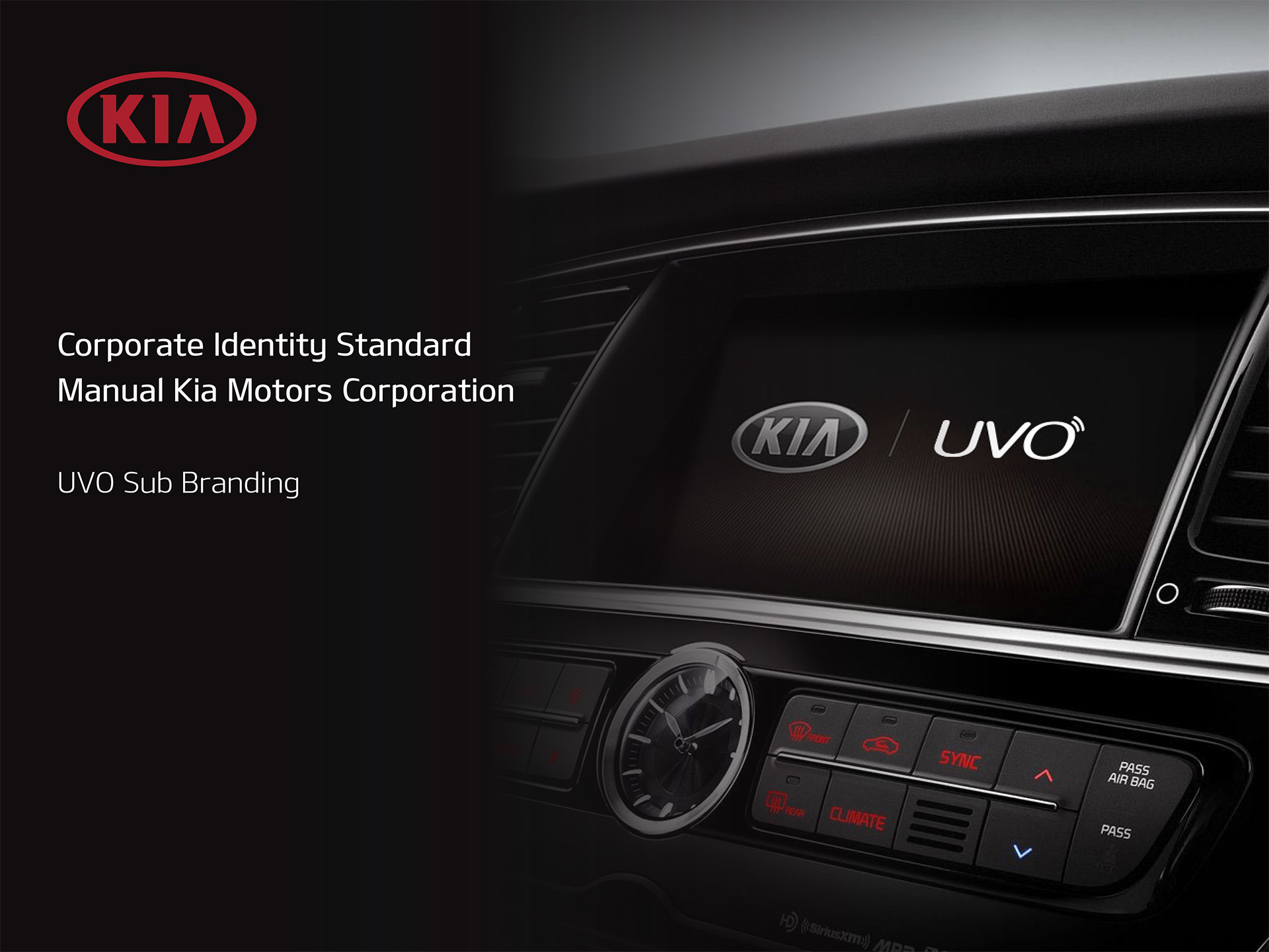
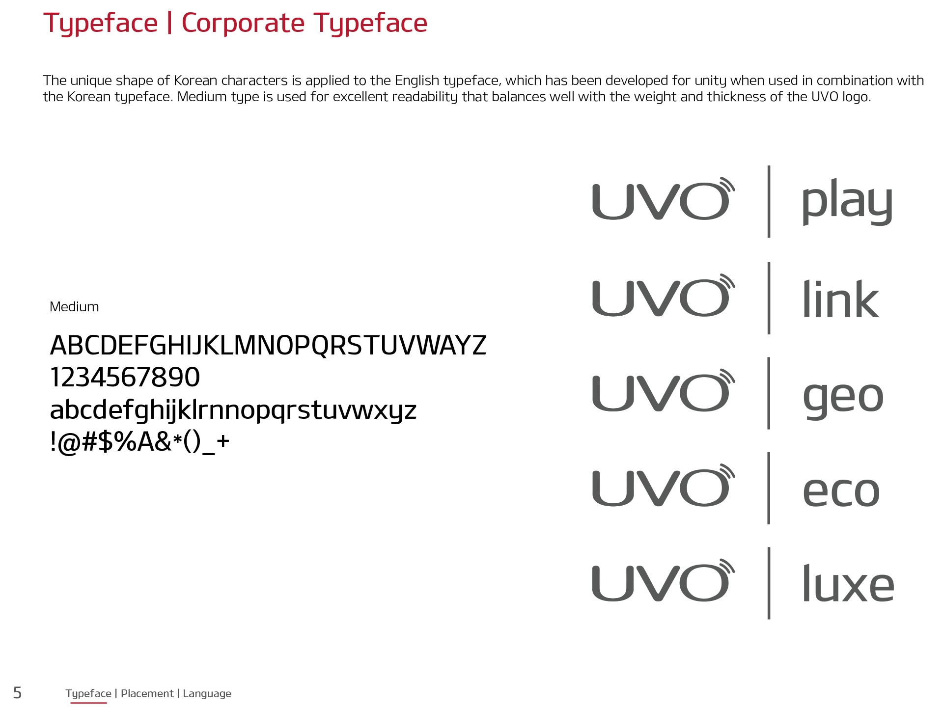
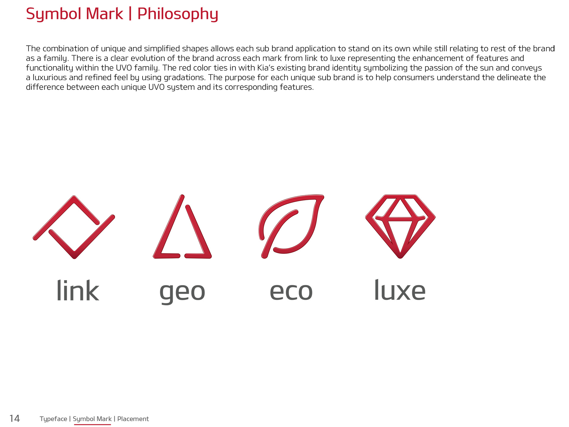
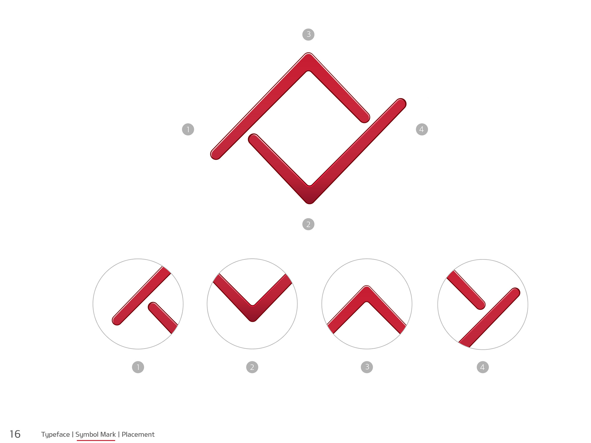
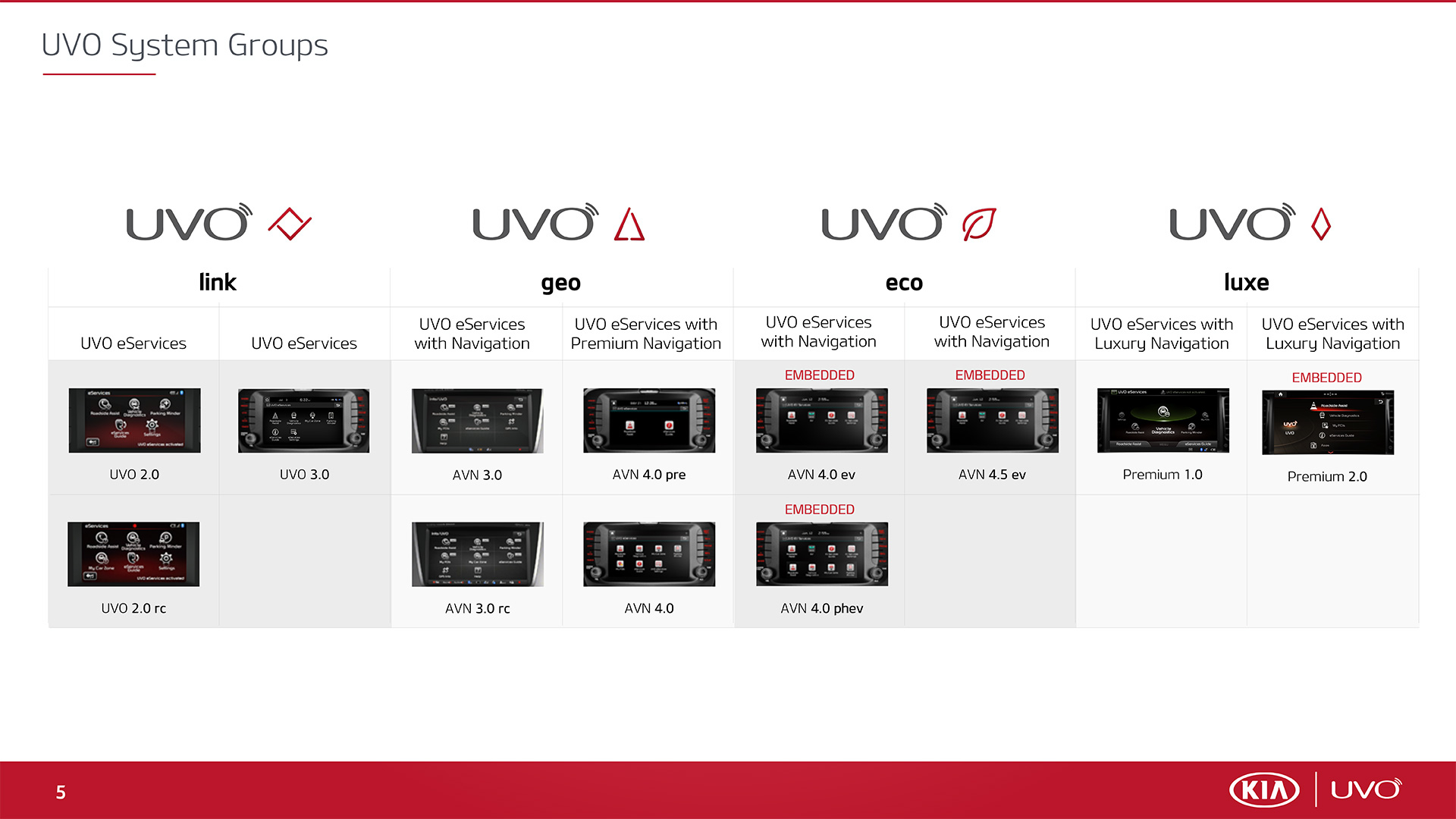
I even led a naming and branding effort for all of the sub brands under their telematics parent brand, UVO. Each sub brand connotes a different level of features, consolidating more than 25 different makes and models into unique and cohesive platforms. This was used as a education tool for both internal teams, dealers and consumers alike to explain all of the features their new Kia has to offer. Take a look at a few key slides from the brand book and educational guide I produced.
Kicking off The redesign
The rebrand led to a us beginning to discuss an update of the their owner's portal and telematics portal, which were both separate sites. Based on our past performance and platform knowledge, we were the sole vendor invited to participate. To kick things off we talked with dozens of internal specialists and teams about what types of features they would like to see in the owner’s portal along with what could be improved with the existing experience. Out of numerous key take aways and findings one thing was clear:
“We needed to combine both the owner’s portal and the telematics portal into one cohesive experience”
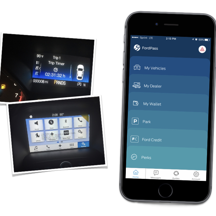
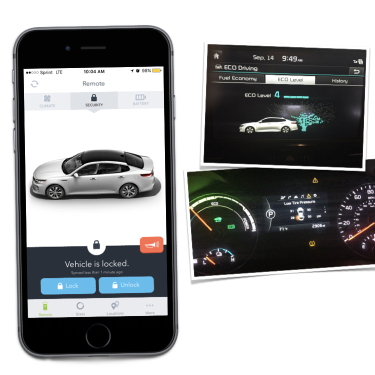
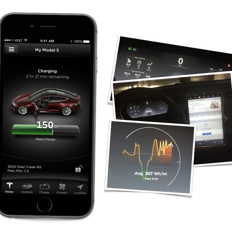
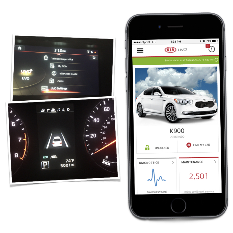
As we started mapping the experience we also needed to do some more homework. Working with Kia’s telematics team, we collaboratively identified their top competitors and best-in-class manufacturers for some competitive analysis. They allowed us to take ownership of a dozen different vehicles to compare and understand different features. We took delivery of everything from Kia’s K900 and Soul models all the way on up to a Tesla Model S.
Competitive Analysis
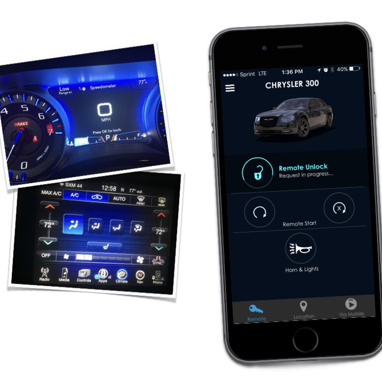
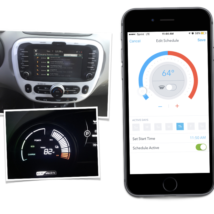
Seeing and experiencing each vehicle first hand was a great way to understand the what it’s like to own the vehicle. We looked at what was available on the web and via mobile apps for the owner to interact with their vehicle. We also documented things like iconography and language so that we could be consistent in tone and voice when designing the new experience.
One of the key takeaways we uncovered from looking at Tesla, Porsche, Audi, Chrysler, Ford and, of course, Kia, is that Kia offers more standard technology and telematics features than any other manufacturer on the market today.
We needed to create an elegant experience that displayed all of these features and gracefully downscaled from flagship to base model. Here's a few samples from our competitive analysis to paint a picture of the landscape, both in car and out.
Wireframe, Prototype & Test
Working collaboratively with Kia’s product owner’s and internal stakeholders we received feedback and sign off from each group as we tackled their respective section of the application.
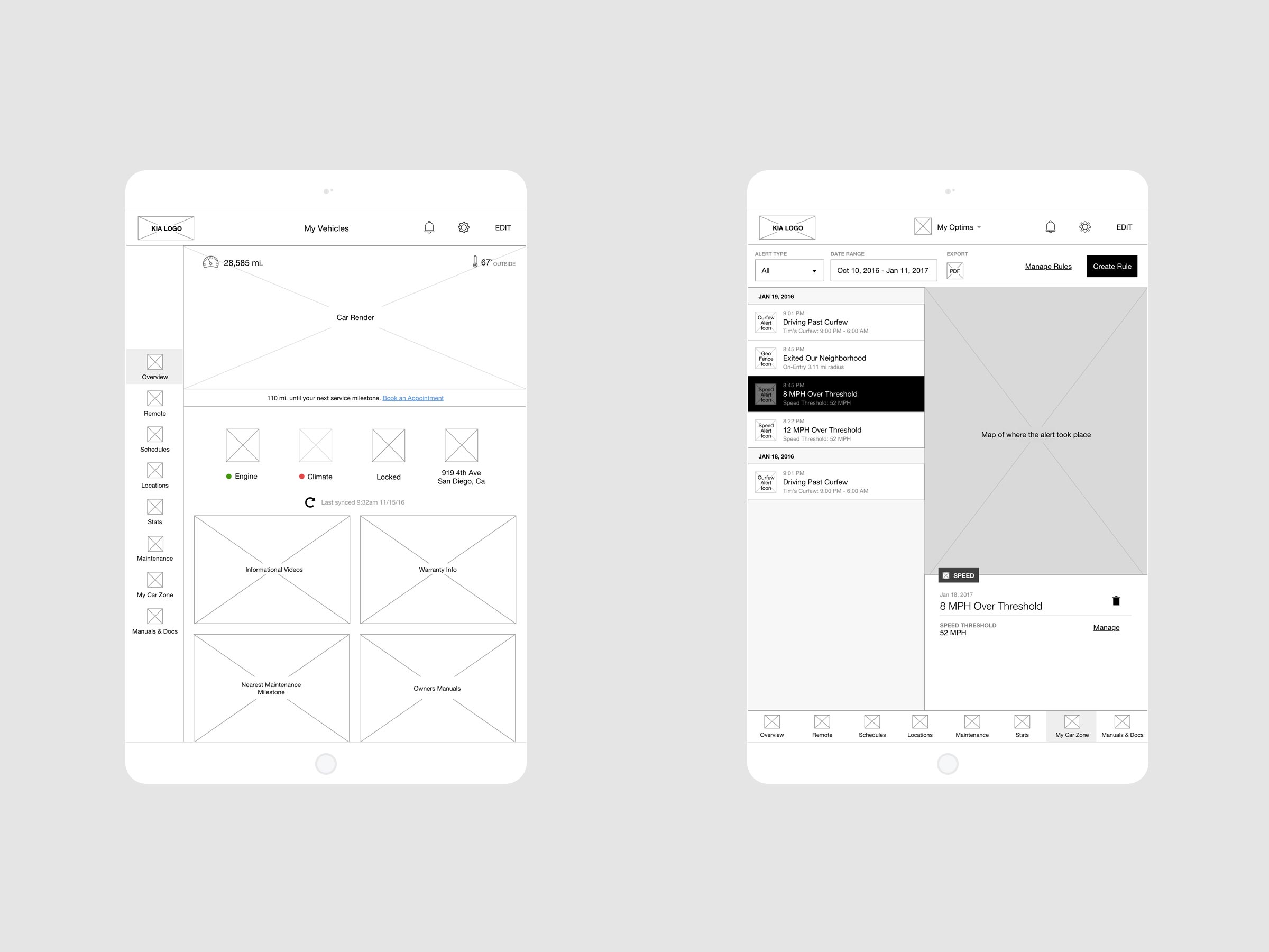
In the wireframing phase we carefully considered each model’s core features and functionality. To ensure we captured everything, we ultimately focused on the flagship model, which has all features and functionality as well as cross reference to the base model and certain electric vehicles, which have some unique added features.
Wireframes with just the right amount of fidelity allowed us to quickly test different layouts and configurations to arrive at optimal solutions. Quick prototypes were built with InVision and Axure.
Building the design framework
This is, of course, responsive across desktop, tablet and mobile. I’m not going to go into detail on every single screen, but trust me, it’s all there. Over 1000 different screens in total. The design framework we created is being utilized across the brand for a refresh of both their marketing site and app frameworks.
My role
–– Product strategy
–– Creative & UX direction
–– Copywriting
–– User interviews
–– Product management
UX & Visual Design
Kyle Blackman
Brand design
Scott Albert
Frontend Development
Brian Burkett


